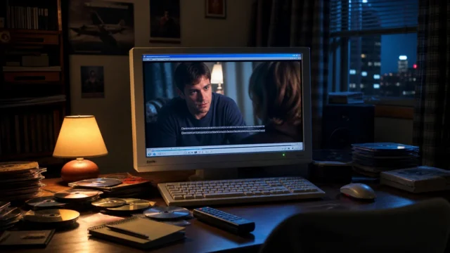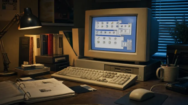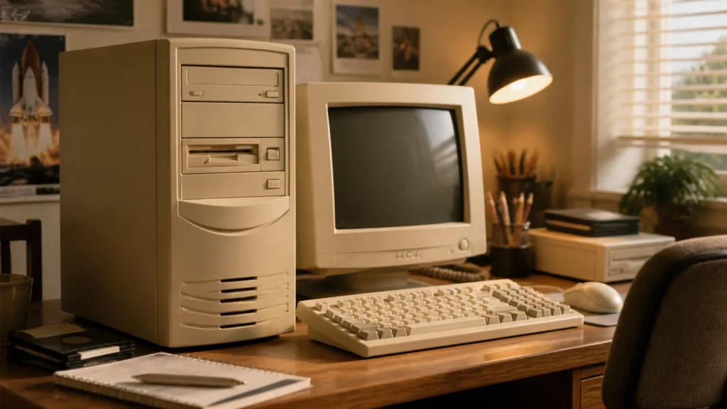
It is difficult to explain beige to anyone who did not live through the reign of the beige box.
Beige was not a brand color.
It was not a bold design statement.
It was not futuristic.
It was not cool in any obvious way.
And yet, if you looked around a typical 1990s desk, beige seemed to have won some quiet political campaign without opposition. Beige towers. Beige monitors. Beige keyboards. Beige printers. Beige mice. Beige speakers, sometimes. Beige plastic spreading across offices, bedrooms, school labs, and family rooms until computing itself started to look like a shade rather than a category.
That is why I do not think the dominance of beige was accidental. It was a visual strategy, even when nobody said it out loud.
- Why beige became the visual language of “serious computing”
- How office culture shaped what a personal computer was allowed to look like
- Why neutrality mattered more than personality for years
- How beige helped computers feel acceptable in ordinary rooms
- Why the revolt against beige mattered when it finally came
- What the beige box still symbolizes now
The historical details below are checked against IBM's historical archive; the interpretation and first-person perspective remain the author’s own.
Beige made computers look safe before they looked exciting
That may be the whole story in one sentence.
The personal computer had to earn permission to sit in everyday spaces. In homes it had to avoid looking too alien. In offices it had to avoid looking too playful. In schools it had to avoid looking too precious. Beige solved all of those problems at once by not trying very hard to be memorable.
It looked reasonable.
Reasonableness is a powerful industrial design tool.
IBM’s own ThinkPad history page, looking back from 1992, contains one of the best retrospective descriptions of the era: designer Richard Sapper "immediately vetoed the ‘hideous beige’ that ruled the computing landscape," choosing black instead. What makes that quote so useful is not just the insult. It is the assumption underneath it. Beige already "ruled" the landscape. That means the color had become more than a habit. It had become the default visual identity of computing itself.
Defaults that strong rarely happen for only one reason.
The beige box inherited the manners of the office machine
I think this is the most important background to remember.
Computers did not emerge into a visual vacuum. They inherited a world already filled with office hardware, typewriters, terminals, printers, filing systems, and equipment designed to look functional first. IBM’s design history page makes clear how seriously the company thought about coherence, practicality, and the relationship between machines and the spaces they occupied. Even the images on that page, including a beige Selectric typewriter, remind us that neutral machine colors were already part of office culture long before beige desktop towers dominated the 1990s.
The PC stepped into that lineage.
It wanted to be accepted as a legitimate work object, not treated like a toy that had wandered onto a serious desk. Beige helped with that. It visually linked the personal computer to earlier families of business equipment. It told the room, "I belong here. I am practical. I am not trying to redecorate the office."
That message mattered in the years when computers were still fighting to be seen as necessary rather than optional.
Neutrality scaled better than personality
When a technology becomes mass-market, personality can become risky.
A striking color might delight one customer and alienate another. A bold form might look modern in one context and ridiculous in another. Beige had the opposite advantage. It was flexible because it was uninsistent. It could sit under fluorescent office light, near wooden desks, beside filing cabinets, in spare bedrooms, in computer labs, or next to printers and monitors from different brands without looking dramatically out of place.
This is why beige was not only conservative. It was useful.
A huge part of consumer electronics history is the story of manufacturers choosing what will provoke the least resistance in the broadest number of spaces. Beige was excellent at that. It harmonized by fading back.
The Computer History Museum’s object records make this visual ubiquity easy to see in hindsight. A Rainbow 100 personal computer is described with a beige case. A Macintosh LC keyboard has a beige case and beige spacebar. Even an RT PC keyboard appears in beige. Different machines, different contexts, same larger palette. The repetition itself is the point.
Beige was becoming infrastructural.
Beige let the computer be present without seeming disruptive
This may be the quality people forget now.
A personal computer in the 1990s still carried some symbolic tension. It represented cost, learning, work, possibility, maybe parental ambition, maybe office modernization, maybe school investment, maybe a family trying to decide whether this thing was truly going to matter. That kind of object benefits from visual modesty.
Beige softened the emotional introduction.
A beige machine looked calmer than a black one, less playful than a brightly colored one, and less futuristic than something aggressive or sculptural. It entered the room without insisting that the room change around it. That made it easier for computing to spread.
In a strange way, beige acted like diplomacy.
It negotiated between the machine’s newness and the user’s need for normality.
The plainness was part of the promise
One reason the beige box became such a durable cultural symbol is that its visual understatement implied reliability. The machine might be complicated inside, but outside it appeared almost apologetically straightforward. Straight lines. flat panels. soft neutral color. Nothing theatrical.
That plainness reassured people.
A beige case did not promise adventure. It promised utility. It suggested that the product would join the world of printers, disks, manuals, forms, and recurring tasks rather than trying to become a lifestyle statement. In the era before consumer technology learned to sell itself as fashion, this was exactly the right promise for many buyers.
That is why I think the beige box deserves a little more respect than it usually gets. It was not beautiful in the glamorous sense. But it was socially intelligent.
The rebellion against beige only proves how dominant it had been
This is where the ThinkPad quote becomes even more revealing.
Richard Sapper’s rejection of the "hideous beige" computing landscape mattered because the landscape was so established that black could feel radical. The black ThinkPad did not only look stylish. It looked like a refusal of the old assumption that computers should disappear into anonymous office neutrality.
That refusal felt important because beige had been doing its job too well for too long.
By the 1990s, once computers were fully accepted as part of everyday life, designers had more permission to ask whether the machine also needed personality. That is the moment when beige begins to look less inevitable and more like a historical phase.
But historical phases are powerful precisely because they once seemed inevitable.
Beige linked the whole desk into one coherent system
I think this is another reason the color lasted.
A PC was rarely alone. It lived with:
- a CRT monitor;
- a keyboard;
- a mouse;
- printers;
- speakers;
- sometimes external drives or scanners;
- and all the cables and ports that made the setup feel complete.
When all of that equipment shared a similar palette, the desk looked unified even if the brands and generations did not match perfectly. Beige was forgiving. It let the system feel assembled rather than improvised.
That visual coherence mattered to households and offices that were already dealing with enough complexity from the technology itself. The color helped the environment look calm even when the configuration was not.
You can feel that same desire for desk coherence in pieces like the chunky connector era, where physical compatibility shaped the whole atmosphere of a workspace. Beige was the color equivalent of that compatibility instinct.
The beige box became a cultural archetype because it was everywhere
This is why the phrase survived.
People do not keep saying "beige box" just because the color was unattractive. They keep saying it because the combination became archetypal. It stood for a whole period of computing when the machine was becoming standardized enough to fade into the furniture of daily life.
In that sense, beige did something ambitious by seeming unambitious.
It helped turn computers from conspicuous novelties into repeatable domestic and office objects. The more ordinary the appearance became, the easier it was for the category itself to expand. That is a huge historical role for a color so frequently mocked in retrospect.
The box was plain.
The cultural work it was doing was not.
What beige still symbolizes to me
Looking back now, I think beige symbolizes a stage of computing when acceptance mattered more than expression.
The machine needed to belong.
It needed to look practical.
It needed to look credible.
It needed to feel like part of a world of work, study, and home routine rather than like a rebellious entertainment object.
Beige solved that by making the computer feel already absorbed into the room.
That is why it still pairs so naturally in memory with the other practical textures of the era: the cables, the printers, the manuals, the chunky ports, the stacks of disks, the faintly humming CRT. Beige was not the star, but it held the whole cast together.
The office-neutral beige box was not the only visual identity in personal computing. The story of how the Commodore 64 defined home computing shows how a machine could feel domestic and culturally distinctive instead.
Final thoughts
Desktop PC cases in the 1990s were so often beige because beige made computers easier to trust, easier to place, and easier to accept.
It connected the PC to office-machine history.
It reduced visual friction.
It helped entire desks look coherent.
It let the computer be important without looking disruptive.
That is why the beige box lasted long enough to become a joke and a symbol at the same time.
It may not have been exciting.
But for a long stretch of computing history, it was exactly the color the machine needed to win the room.