Office 2003 belonged to the last age when productivity software still felt like furniture.
Not the decorative kind.
The dependable kind.
The kind you learned by touch.
The kind where your hands knew where things lived before your eyes fully asked the question.
That is what I miss most about it now.
Not merely the menus.
Not merely the toolbars.
Not even just the fact that it was “before the Ribbon.”
What I miss is the coherence.
Office 2003 felt like the mature endpoint of a language Microsoft had been refining for years. By the time it arrived, the classic interface grammar of menus, toolbars, dialog boxes, and side panes no longer felt old. It felt complete. Then a few years later the Ribbon arrived and, as Microsoft’s own Fluent Ribbon overview later put it, replaced the previous system of layered menus, toolbars, and task panes.
That change solved real problems.
But it also closed a chapter.
And Office 2003 now looks, in retrospect, like the final polished version of a very particular idea of how software should think alongside you.
- Why Office 2003 feels like the full maturity of classic Office
- How menus and toolbars created a powerful kind of memory
- Why task panes expanded the interface without breaking it
- What the Ribbon improved and what it displaced
- Why the nostalgia still lands so strongly now
It arrived at the moment the old interface language had finally grown up
By 2003, Microsoft Office was not inventing its core grammar anymore.
It was refining it.
Microsoft’s own March 2003 beta announcement and August 2003 RTM announcement framed the Office System as something larger than a set of desktop apps: connected, XML-aware, role-conscious, increasingly integrated with business processes and online services. That is the part people often remember in the abstract. But what I think mattered emotionally is that all this new ambition arrived without tearing up the familiar map of the interface.
That balance was the genius.
Office 2003 still looked and behaved like Office in the old, deeply internalized way:
File,Edit,View;- toolbars that stayed visible and literal;
- dialog boxes that felt mechanical but trustworthy;
- commands that lived in places your brain could rehearse and retain.
The software was getting smarter, but it was not pretending it needed to become a different species to prove it.
That restraint is what feels so elegant now.
Menus and toolbars were not clutter when you had learned their geography
One thing the Ribbon era sometimes encouraged people to forget is that the old Office interface was not chaotic once it became familiar.
It was memorized space.
There was a physicality to it, even though it was software. You did not just “look for a feature.” You traveled to it. You knew which menu opened the right neighborhood. You knew the toolbar button by shape, not only by label. The interface became a small internal map, one that got smoother the longer you lived with it.
That experience mattered because knowledge compounded.
You were not rediscovering the program every day.
You were inhabiting it more efficiently.
And there was something deeply adult about that relationship. Office 2003 trusted that you might become skilled. It did not treat every interaction as a fresh onboarding moment. It was willing to reward memory.
That is one reason the classic Office experience still feels different from many modern productivity tools, which often optimize for first-use discoverability more aggressively than long-term familiarity.
Task panes were the quiet brilliance that kept classic Office from going stale
This is where I think Office 2003 gets underrated.
People remember menus and toolbars, but they sometimes forget how much Microsoft was already trying to stretch the interface through task panes, Research tools, and smart contextual side surfaces. Microsoft’s Office 2003-era documentation on interface extensibility and task-pane-era development makes it clear that these side areas were not accidental ornament. They were part of the way Office was expanding.
That mattered because task panes let the suite become more ambitious without demolishing the old grammar.
Instead of saying, “The whole shell must be reinvented,” Office 2003 often said:
- “Keep the familiar top-level structure.”
- “Add depth at the side.”
- “Let new workflows emerge without disorienting the user.”
That was such a smart compromise.
The software could grow more connected, more research-oriented, more document-aware, more workflow-aware, and still preserve the feeling that the main desk had not been dragged into another room overnight.
In that sense, Office 2003 was not static at all.
It was evolving.
It was just evolving politely.
Before the Ribbon took over, power still looked calm
I think this is the core of my nostalgia.
Office 2003 did not look afraid of itself.
It did not seem anxious that features were buried simply because they were nested in menus or because expert users needed to remember where things lived. It assumed power could be layered. It assumed not every command needed to present itself at all times like a candidate fighting for your attention.
That made the suite feel calmer.
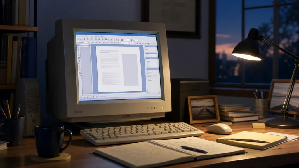
A mature Office 2003 workspace had density, yes, but it also had discipline. Buttons sat where they belonged. Toolbars were concrete. The visual rhythm of the screen felt mechanical in a reassuring way. Even when you were working late, tired, and slightly irritated, the interface rarely felt like it was trying to teach itself to you all over again.
That is not a small thing.
It is the same kind of comfort I still associate with other software from the era, whether that is the atmosphere around Windows Media Player 9 or the familiar directness of MS Paint. Different tools, different jobs, same underlying confidence: the program trusted repeated use to become intimacy.
The Ribbon solved discoverability, but it broke inherited memory
I do not want to be unfair to what came next.
Microsoft’s own Fluent Ribbon documentation says the Ribbon replaced the older layered system and was designed around a simpler interface optimized for efficiency and discoverability. That was not nonsense. Many people did find hidden features more easily once commands were surfaced more visually.
But every interface improvement has a cost.
And I think the cost here was a break in memory.
The old relationship with Office had been:
- learn the geography;
- internalize the structure;
- move faster because the space stays stable.
The Ribbon changed that relationship. It made the interface more exposed, more tabbed, more scenario-driven, and in some ways more legible to newer users. But it also replaced a learned desk with a more dynamic presentation layer.
That is why people who loved Office 2003 often did not only resist the Ribbon out of conservatism.
They resisted it because something real had been taken away:
the satisfaction of inhabiting a mature system whose structure you already owned.
Office 2003 still feels like the last version that understood continuity
That may be the simplest way I can explain my affection for it.
Office 2003 felt like continuity at full strength.
It inherited years of interface language.
It expanded through side panes and smarter workflows.
It lived naturally inside the Windows XP era.
And it still treated muscle memory as a design partner, not as a temporary inconvenience on the road to something flashier.
That makes it feel, in hindsight, like the last version of Office that believed software could become second nature without needing to reintroduce itself as a new philosophy.
For users who had grown with it, that was not boring.
That was grace.
Verification note: Historical and technical details in this retrospective were cross-checked against Microsoft’s Office 2003 support announcement.
For broader context, continue with Why Total Commander Still Has a Cult Following Among Techies and CD-R vs. DVD-R: The Optical Storage Revolution.
Conclusion
The genius of Microsoft Office 2003 was that it represented the mature endpoint of the classic Office interface before the Ribbon changed the grammar of productivity software. Microsoft’s own 2003 materials show a suite that was becoming more ambitious through research tools, task panes, XML-era workflow thinking, and role-focused features, while still preserving the menu-and-toolbar geography people had learned over years. Later Microsoft documentation on the Fluent Ribbon makes the transition explicit: the Ribbon replaced the older system of layered menus, toolbars, and task panes.
That is exactly why Office 2003 now feels so special. It was not merely older. It was complete. It offered power without spectacle, evolution without disorientation, and familiarity without stagnation. For people who learned its rhythm, it still feels like the last version of Office that behaved like a perfectly organized desk instead of a new philosophy of work arriving every morning.
FAQ
Was Office 2003 really better than the Ribbon versions, or just more familiar?
Part of its appeal was definitely familiarity, but I do not think that is the whole story. Office 2003 also represented the mature, polished endpoint of a long-evolved interface system that rewarded memory and calm navigation, while still expanding through task panes and smarter document features.
Why do people still react so strongly to the arrival of the Ribbon?
Because it did more than move commands around. It changed the mental model of the suite. For many long-time users, the issue was not only retraining. It was the feeling that a well-learned geography of work had been replaced by a different philosophy of discoverability.
Was Office 2003 actually modern for its time, or just the end of an old idea?
It was both. That is what makes it interesting. Office 2003 preserved the classic desktop grammar, but Microsoft was also pushing research tools, task panes, XML-related workflows, and more role-specific productivity ideas. It was not technologically frozen. It was simply evolving without throwing away the interface users already understood.
Why do task panes matter so much in discussions about Office 2003?
Because they show that Microsoft already had a way to expand the suite without rebuilding the entire top-level interface. Task panes let Office grow sideways instead of erupting upward into a completely new surface. They were one of the clearest signs that Office 2003 was trying to modernize while preserving continuity.
Is the nostalgia for Office 2003 mostly about the software or about the era around it?
Probably both. Office 2003 is tied to a broader Windows XP-era feeling of stable desktops, learnable interfaces, and software that rewarded repetition. But even if you isolate the suite from that period, its structure still stands out. The nostalgia lasts because the design itself was disciplined, not only because the memories are warm.