Windows did not always begin with the Start button.
That sounds obvious if you know the timeline, but it still feels emotionally important to say out loud. For many people, the Start button became the mental front door of Windows. It taught us where software lived, where settings lived, where shutdown lived, where the operating system wanted us to begin.
Windows 3.11 belonged to an earlier feeling.
It did not really begin with a front door at all.
It began with a room.
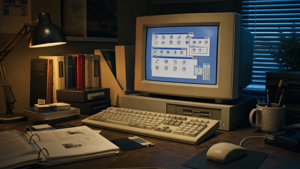
That room had groups, icons, utilities, little boxes, and a strange blend of order and awkwardness that made the machine feel more mechanical than modern Windows ever would again. That is the charm I still remember. Not polish. Not elegance. Charm in the older sense of the word: something slightly inconvenient, slightly rigid, and somehow more lovable because of it.
- Why Windows 3.11 felt different before the Start button existed
- How Program Manager made software feel like a collection of rooms
- Why File Manager made the file system feel exposed and real
- How the interface carried both simplicity and friction at once
- Why this version of Windows still feels intimate in memory
- What it says about the era before the modern shell settled in
The historical details below are checked against Microsoft's official documentation; the interpretation and first-person perspective remain the author’s own.
Before the Start button, Windows felt less centralized and more physical
Once Windows 95 arrived, the shell taught people a new habit: begin at the bottom left, then move outward from there. Raymond Chen later described how Program Manager as a shell interface was replaced in Windows 95 by Explorer and the Start menu. That change was not just technical. It changed the emotional geometry of using a PC.
Windows 3.11 still belonged to the period before that geometry hardened.
Instead of one main launch point, you had Program Manager groups, each one feeling a little like a drawer or shelf. Instead of the system saying "start here," it felt more like it was saying, "here are the things; learn where they live."
That difference made the machine feel less guided and more discovered.
Modern interface design often tries to reduce hesitation. Windows 3.11 still had some hesitation in it. You had to look. You had to learn. You had to remember which group held which utility. There was friction, yes, but also personality.
Program Manager made the computer feel like a cabinet of labeled tools
This is probably the center of the whole memory for me.
Program Manager did not feel like a contemporary app launcher. It felt more like an organized desk seen from above. Groups opened as separate windows. Inside them, icons waited in clusters. Nothing about it suggested immersive seamlessness. It suggested arrangement.
That arrangement matters in memory because it gave software a stronger sense of place.
Games lived somewhere.
Accessories lived somewhere.
Main applications lived somewhere else.
Utilities had their own shelf-like seriousness.
This is part of what made Windows 3.11 feel so different from later versions. The shell had not yet been unified into the now-familiar desktop, taskbar, and Start-menu rhythm. Even Raymond Chen’s writing about old shell behavior preserves that dividing line: the old Program Manager world on one side, the Explorer-and-Start-menu world on the other.
That older world felt less abstract to me. It may have been less efficient by some measures, but it was easier to imagine spatially. The software did not simply exist in the system. It lived in named places you could revisit.
File Manager made files feel like real structures rather than vague belongings
If Program Manager organized applications into groups, File Manager did something even more important: it made the file system feel exposed.
Not friendly, exactly.
But exposed.
You could see drives, folders, hierarchy, and structure without much cushioning. The machine was not trying especially hard to protect you from the idea that files existed inside a tree of locations. That directness gave early Windows a feeling that now seems almost educational by accident.
It belongs to the same broader culture as the software I wrote about in Total Commander still having a cult following. The common thread is not identical design. It is the sense that file management was a visible craft, not merely a background convenience.
This was one of the quiet gifts of older Windows. It still let the machine look like a machine.
The charm was partly that it had not yet become culturally "normal"
Windows 3.11 still carried some of the feeling of graphical computing being a thing you were learning rather than a thing the world had already standardized.
Microsoft’s own history pages frame Windows 3.1 as a major moment in the early 1990s, and the 1993 company history still places Windows for Workgroups 3.11 squarely in that expanding Windows world. But from the user’s side, what I remember is not market success. I remember the sense that the interface itself still felt like an evolving idea.
The windows overlapped in ways that could feel cluttered.
Dialogs sometimes looked plain to the point of severity.
Utilities felt closer to tools than to experiences.
The machine did not flatter you for being there.
And somehow that gave it dignity.
Today, so much software tries to feel inevitable. Windows 3.11 still felt provisional in the best possible way, as if the people building personal computing had not yet fully decided what the polished end state should look like.
It was simple, but never in the modern sense of "gentle"
This is an important distinction.
People sometimes romanticize older interfaces as simpler, and technically that can be true. There were fewer layers, fewer services, fewer background assumptions, fewer abstractions piled on top of one another.
But they were not always gentle.
Windows 3.11 could be direct without being comforting. It could be understandable without being soft. The interface was often plain enough that your brain had to meet it halfway. Icons were clearer than command lines, but they still belonged to a world where the user was expected to do some interpretive work.
That is part of the same emotional territory I described in why MS-DOS batch files made everyone feel like a hacker. Older systems often felt empowering precisely because they did not over-translate themselves for you. They offered less hand-holding, but more of the exhilarating sense that you were learning how the thing actually worked.
It still felt connected to DOS, and that mattered
Windows 3.11 never felt fully sealed off from the older PC world beneath it.
That matters more than nostalgia sometimes admits. The machine still felt like it had layers. Windows was not yet the total emotional identity of the computer. DOS was still nearby in the imagination, in boot flows, in utilities, in the cultural atmosphere of how the PC was understood.
So using Windows 3.11 did not feel like entering a completely self-contained software universe. It felt more like entering a graphical district built on top of an older city.
That layered feeling made the system richer in memory.
You could draw in Paint, move through File Manager, open groups in Program Manager, and still feel that the stricter older logic of computing was standing just behind the wallpaper. That is part of why early Windows feels so different from later Windows, which became much better at hiding its scaffolding.
Before the Start button, starting itself felt less obvious
There is something oddly charming about an operating system that had not yet fully solved the emotional problem of where everything begins.
Raymond Chen’s history of the Windows 95 shell notes that even the eventual Start menu had ancestors in earlier shell ideas. That transition matters because it reveals that "click Start" was not an eternal truth. It was a design answer that arrived later.
Windows 3.11 still belonged to the before.
And the before had its own beauty.
There was something more exploratory about it. Launching things felt less like following a standardized ritual and more like opening compartments in a familiar case. The machine rewarded memory, not just recognition. You built a personal map of the environment rather than being handed one universal doorway.
That may not sound better from a usability-study perspective. But emotionally, it made the computer feel more like a place and less like a service.
It looked mechanical, and I mean that as praise
The visual world of Windows 3.11 had a kind of stern honesty to it.
Icons were icons.
Groups were groups.
Buttons looked like buttons.
Utilities looked like utilities.
Nothing was trying to become ambient lifestyle design.
The machine felt assembled rather than smoothed.
That is one reason the era still pairs so naturally in memory with the other tactile experiences around it: the sound of floppy drives, the glow of a CRT, the little household rituals of booting, launching, and saving. It belongs to the same emotional shelf as floppy disks feeling bigger than 1.44 MB or Paint feeling like a private creative room. The PC was not invisible yet. It still had texture.
Its charm came partly from the fact that the interface still felt like a visible layer on top of computing, not a polished universe pretending there was no machinery underneath.
Nostalgia should not pretend it was perfect
It was not.
Windows 3.11 could be clunky, limited, and visibly transitional. It belonged to an era when interface conventions were still settling, when overlap could become clutter, when hierarchy could become confusion, and when learning the system often meant tolerating a little awkwardness.
And yet that awkwardness is part of the affection.
The system did not feel frictionless because the era itself was not frictionless. Personal computing still had edges. It still asked things of you. The OS did not try to convert every action into comfort. Sometimes it just gave you the tools and expected you to adapt.
That would be a poor argument for returning to the past wholesale.
It is, however, a good explanation for why the memory remains so vivid.
What Windows 3.11 still means to me
When I think about Windows 3.11 now, I do not mainly think about version numbers or networking editions or whether one component was better than another in isolation.
I think about the feeling of computing before a lot of today’s assumptions became permanent.
Before the taskbar became normal.
Before the Start button became instinct.
Before the shell became a unified emotional story.
Windows 3.11 still belonged to the era when personal computing felt slightly more like a workshop. Less guided, less polished, more compartmentalized, and somehow more intimate because of it.
Conclusion
The charm of Windows 3.11 lives in the fact that it came before the modern Windows shell taught us where everything should begin. Program Manager, File Manager, groups, and visible utilities gave the system a different emotional architecture. It felt less like a seamless desktop and more like a collection of rooms you slowly learned how to move through.
That older structure was not better in every practical sense. It was rougher, stranger, and often less graceful.
But it also made the computer feel more like a machine you were getting to know.
And for some of us, that remains one of the most beautiful feelings personal computing ever had.